


HELLO
I’m Gabrielle, a graphic designer passionate about brand identity, packaging, and bringing ideas to life through thoughtful design. I love being creative in all forms... whether through advertising, marketing, social media, or visual storytelling. Scroll down to explore my work and see how I turn concepts into creative solutions.

COMING SOON
RunOX is a community run club in Oxford, MS that brings people together through movement and connection. I’m redesigning their brand to capture that energy with a modern, approachable identity that reflects both athletic spirit and community warmth.

COMING SOON
The Run of Champions is a 5K and 8-mile race winding through Oxford, Mississippi, and finishing at the University of Mississippi’s Walk of Champions. I’m developing an identity for the event that highlights its energy, community spirit, and deep connection to tradition.
KEEP SCROLLING
THERE'S MORE!


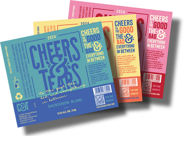
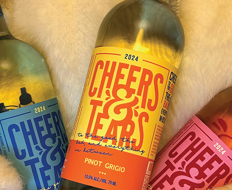
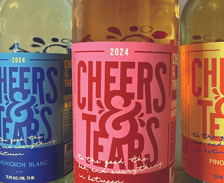
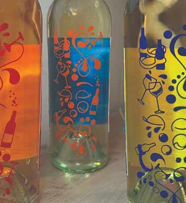
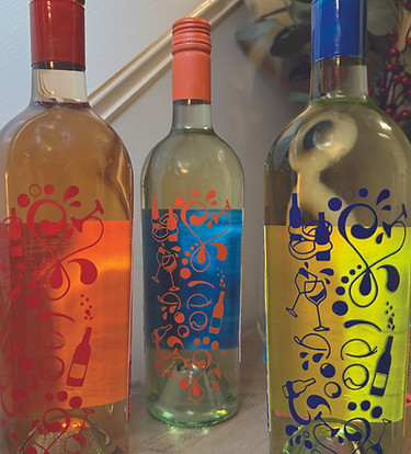
CHEERS & TEARS
Cheers & Tears is the cheeky companion for life's ups and downs... because every bottle should speak to your heart. We celebrate the messy, magical journey of life with wines full of personality, perfect for laughter, tears, and everything in between. More than a wine brand, we are your partner in joy and comfort, turning simple sips into meaningful moments.
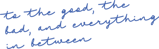
Raise a glass to the good, the bad, and everything between.

FALL 2024
PACKAGING
BRANDING
LOGOTYPE
ILLUSTRATION
SCREEN PRINTING
TYPOGRAPHY
Click to see "behind the bottle"
and all that is Cheers & Tears.


Scroll Down


At The Lady’s Loft, we honor the legacy of Nashville’s suffragists
whose courage secured the freedoms we enjoy today. Our hotel
blends thoughtful design, historical exhibits, and community partnerships to celebrate women’s strength, resilience, and
progress. By preserving their stories, we aim to inspire future
generations to keep breaking barriers and making their
voices heard.
THE “LADY”
& HER HISTORY
FALL 2024
PACKAGING
BRAND IDENTITY
LOGO DESIGN
ILLUSTRATION
SENIOR THESIS


(RESKIN)
FALL 2024
PACKAGING
BRANDING
LOGO DESIGN
TYPOGRAPHY
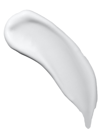
I redesigned the packaging and logo for Cetaphil with a fresh, modern aesthetic to better connect with a youger audience. By simplifying the logo and incorporating clean lines, soft colors, and a minimalist layout, the new design reflects a more contemporary, visually appealing look. This updated style maintains Cetaphil's trusted identity while makeing it feel more relevant and engaging for today's skincare-savvy generation

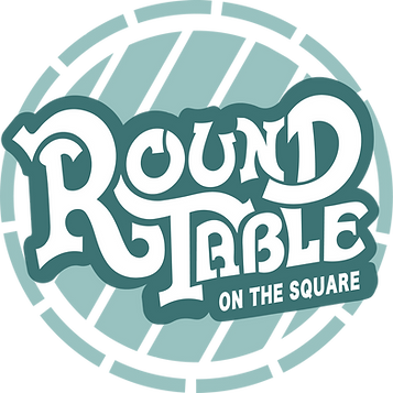
ROUND TABLE
(REDESIGN)
FALL 2024
I redesigned the logo for Round Table, a beloved bar in Oxford Mississippi known for its loyal Ole Miss fan base and vibrant college crowd. Inspired by the original logo's color palette,
I created a modern, clean design that aligns with today's aesthetic while preserving the bar's classic spirit.
BRAND IDENTITY
LOGOTYPE
TYPOGRAPHY
ILLUSTRATION


KEEP SCROLLING
THERE'S MORE!

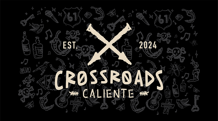
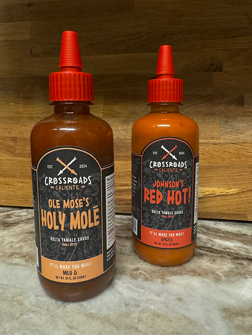
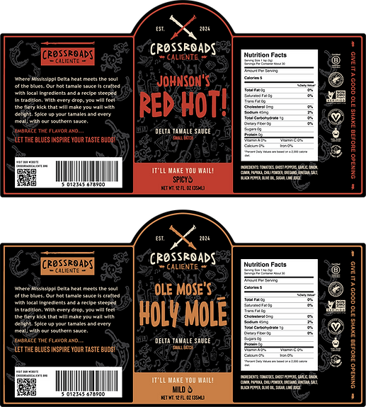
CROSSROADS CALIENTE
Crossroads Caliente is a small-batch Delta tamale sauce inspired by the fiery soul of Mississippi blues. Johnson's Red Hot brings sharp heat with Ghost Pepper and Mississippi Spur, channeling Robert Johnson's legendary sound. Ole Mose's Holy Mole offers a smoky burn with Pasilla-type peppers, a nod to Rev. Moses "Red Hot Ole Mose" Mason. The packaging features rustic
hand-drawn illustrations inspired by Delta folklore, with their flavor path.
FALL 2024
BRAND IDENTITY
LOGOTYPE
TYPOGRAPHY
ILLUSTRATION
PACKAGING

%204_edited.png)
DO THE RIGHT THING!
MAKE SURE OTHERS ENJOY THE GO
This ad for Charmin brings humor and relatability to the all too familiar moment of discovering an empty toilet paper roll. Featuring the iconic Charmin bears caught mid-crisis, the ad taps into a universal experience with a playful twist.
The message is clear... do not be that person. Do the right thing... and refill the roll with Charmin! The design uses expressive character reactions and bold type to drive home both the comedy and the call to action.
BRAND IDENTITY
ILLUSTRATION
TYPOGRAPHY
FALL 2023

.jpg)
%205_edited.jpg)


FALL 2023
BRAND IDENTITY
LOGO DESIGN
ILLUSTRATION
TYPOGRAPHY
PACKAGING
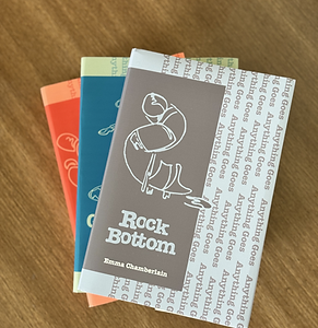
ROCK
BOTTOM
Emma Chamberlain reveals what it means to hit rock bottom, speaking candidly about the creative drought that left her uninspired and weighed down by guilt and self-doubt. What begins as a confession of burnout unfolds into an exploration of resilience... showing how pausing and sitting with discomfort can bring unexpected clarity. From her lowest point, Emma begins to rebuild, finding strength in vulnerability and rediscovering the spark that
drives her forward.
THE FEMININE MOLD
Emma reflects on the impossible standards of femininity she grew up with... images that made her doubt her worth and feel she didn’t fit the mold. Through candid honesty, she explores how these pressures shaped her self-esteem and shares the realization that true happiness begins when we break free from those molds and embrace who we really are.
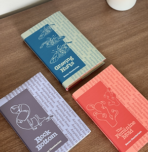
GROWING
HURTS
Emma explores the painful yet transformative process of personal growth. She emphasizes the importance of intentional alone time... without distractions... to reflect, heal, and build self-reliance. Though isolating and uncomfortable at first, that deliberate solitude plants the seeds of wisdom, better decisions, and deeper fulfillment over time.
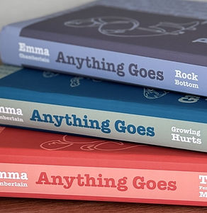
This book cover series is inspired by Emma Chamberlain's podcast, "Anything Goes"... a space known for its candid, introspective, and often chaotic energy. I designed each cover using fun, monochromatic color palettes that reflect Emma's laid-back yet emotionally honest vibe, balancing simplicity with personality. Each cover features a custom illustration that metaphorically represents the book's core theme. The visuals speak to vulnerability, growth, and self-reflection.


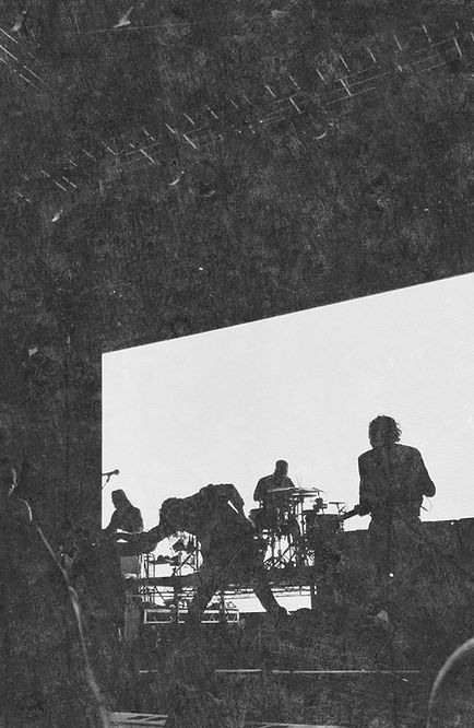


Mokoto is a California-based indie folk band made up of a group of creative, genre-blending teenagers. The band's name, Mokoto, is a tribute to the lead singers's Japanese grandmother, whose stories and spirit inpsire much of their music. The visual identiy blends softness and edge-honoring heritage while reflecting the band's youthful energy.
BRAND IDENTITY
LOGO DESIGN
VINYL DESIGN
ILLUSTRATION
FALL 2023
MOKOTO


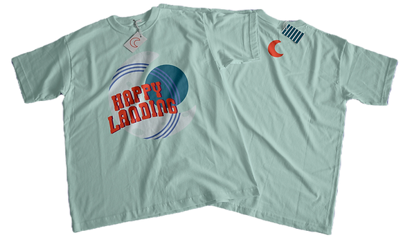
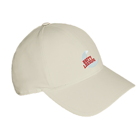
This gig poster for Happy Landing reinterprets the band's bold logo with a fresh, modern edge... capturing their indie folk sound through moody yet youthful colors and a clean, intentional layout. While the design reflects Happy Landing's identity, it also draws subtle inspiration from the soulful, vintage aesthetic of Maggie Rose, blending her bluesy warmth with the band's raw, emotional tone.
BRAND IDENTITY
LOGO DESIGN
POSTER/MERCH
TYPOGRAPHY
SPRING 2023
HAPPY LANDING X MAGGIE ROSE

FROM A DISTANCE
SPRING 2023
This series of hand-manipulated typography posters plays with perception. From a distance, the designs appear clean and composed, but up close... they reveal a dense wall of text filled with my own insecurities, fears, and emotions. The contrast reflects the idea that what looks put together on the outside often hides deeper truths within.


